Educating for Excellence
Brand Identity
The most prominent and significant advantage of the Educating for Excellence Association is the educational-social continuum that it offers to the thousands of children, young people and youths participating in the program; From the age of 8 to the age of 28, from elementary school to the beginning of a career. In other words, ‘Educating for Excellence’ takes the participants on a long path, a real journey – and hence the road to the brand story and also to the visual solution was short. The first thing that had to change was the communicational language: there are no more “instructors” – there are guides, there is no “schedule” – there’s a travel diary, and “achievements” have become summits.
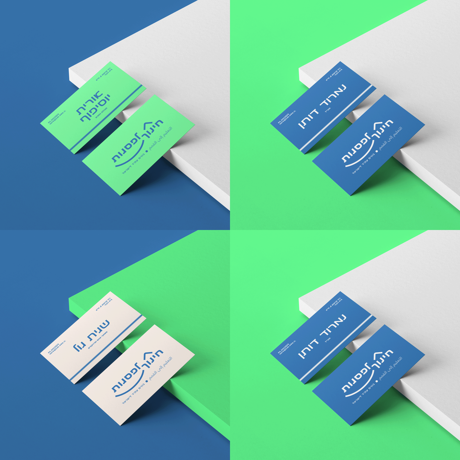
From the visual point of view, we focused on the one element that distills the narrative of the journey into one symbolic element – the horizon line. From the new logo, which contains a symbol of a horizon line of mountain peaks, to the brand’s versatile grid system, they are all based on one horizontal line that is conceptually and graphically dominant. Using one blurred line, crossing each format from end to end, a simple but very recognizable and memorable visual language was created.
The colour scheme was also derived from the simplification of the horizon’s image; Blue water, white horizon line, creamy sky, and green plains that got a contemporary twist in the form of a bright RGB shade.
The use of large typography as a visual asset, alongside freestyle graphic elements that are incorporated into the typography and imagery, makes the brand straightforward, communicative, and fit for all of its target audiences.
Designed at Re-Levant.


