Meretz
Rebranding, Campaign
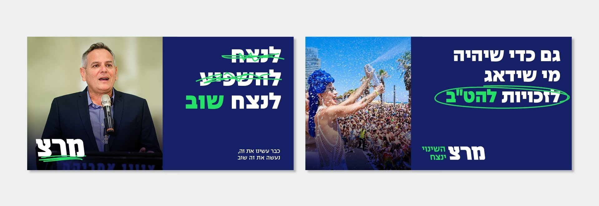
Israel's fifth elections in a row created a double challenge for Meretz; first - to keep potential voters engaged, and second - to embrace the party's new position as a member of the previous government.
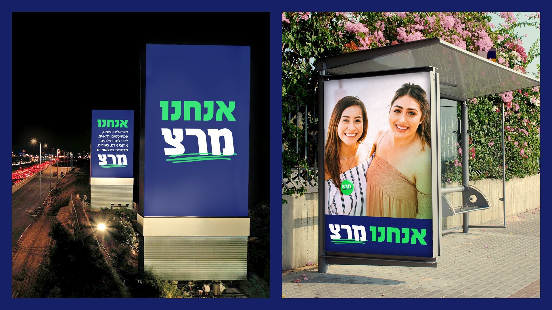
Our solution was as simple as it was impactful; we took Meretz’s colour palette and almost inverted it. Meretz’s traditional green (which was also updated into a more digitised tone) went from being the primary colour to a secondary colour, highlighting the brand’s deep blue backgrounds. This change implied that Meretz's green is that spark of colour that highlights and promotes important issues from within the government's deep "Israeli" blue.
Another key element of the new visual identity was the doodle - freestyle unpolished lines, which we also used as a graphic/typographic element that reacts to text and imagery.
Designed at Re-Levant.


