Yaeli Deli
Brand Identity
Café Yael was literally a hidden gem at the center of Tel Aviv. Either you knew it was there, or you simply didn’t. In a very Tel Avivi manner, this fact added to its charm. When the owner decided to expend and open a delicatessen next door (Yaeli Deli), it was a good opportunity to brand both the café and the deli.
Our meetings with both the staff and costumers, showed that the dominating theme of this place is the combination of words “Simple” and “Good”.
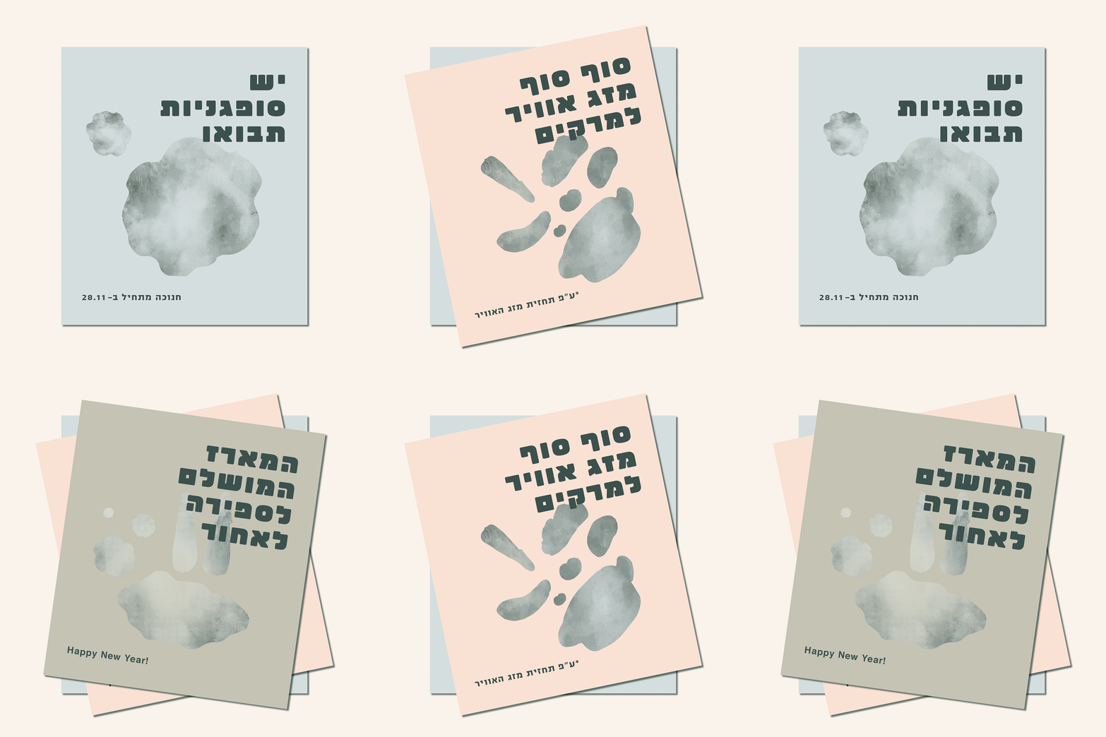
Since a good and simple food, first and foremost, deals with the senses, we created a set of semi-abstract shapes in water colours. The roughness of the shapes and the water textures are a tribute to the way people experience food.
The visual language, bold typography and straightforward messages, create aesthetics that are a manifestation of the attitude and values that Café Yael costumers know and love.
Designed at Re-Levant.


